Understanding ECRA’s Comparative District Analysis Data Brief
A Look into How Peer Comparisons Support Strategic Conversations
School district leaders are tasked not only with improving student outcomes, but also with demonstrating progress in a transparent and meaningful way. One valuable tool that can support these efforts is a Comparative District Analysis from ECRA, which allows district leaders to understand their performance in the context of up to nine other school districts.
While we do provide State Report Card data briefs in several states, this article will discuss the California Comparative District Analysis. This data brief offers insights into how your district performs relative to a peer group of up to nine other districts, selected by you. The comparisons include academic achievement, student demographics, district-level characteristics, financial indicators, and more.
What makes this data brief especially valuable is that it not only provides a snapshot of how your school district is doing, but also helps explain why performance may differ from one district to another.
What Insights Does this Data Brief Offer?
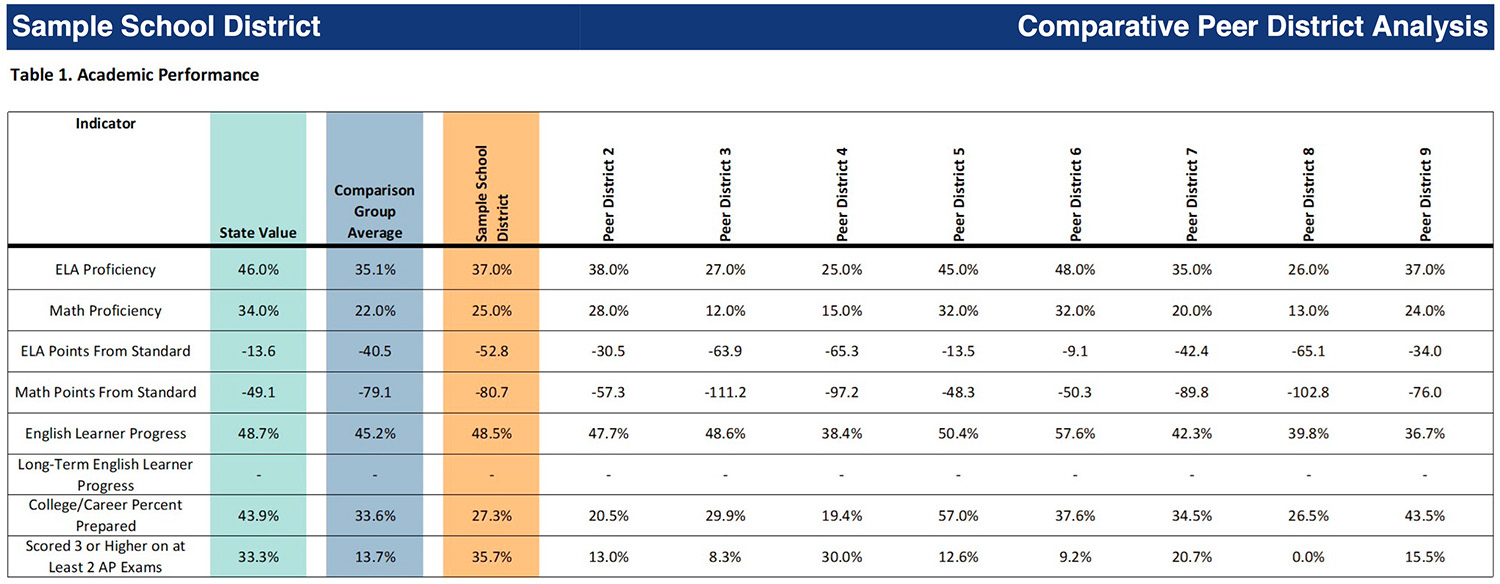
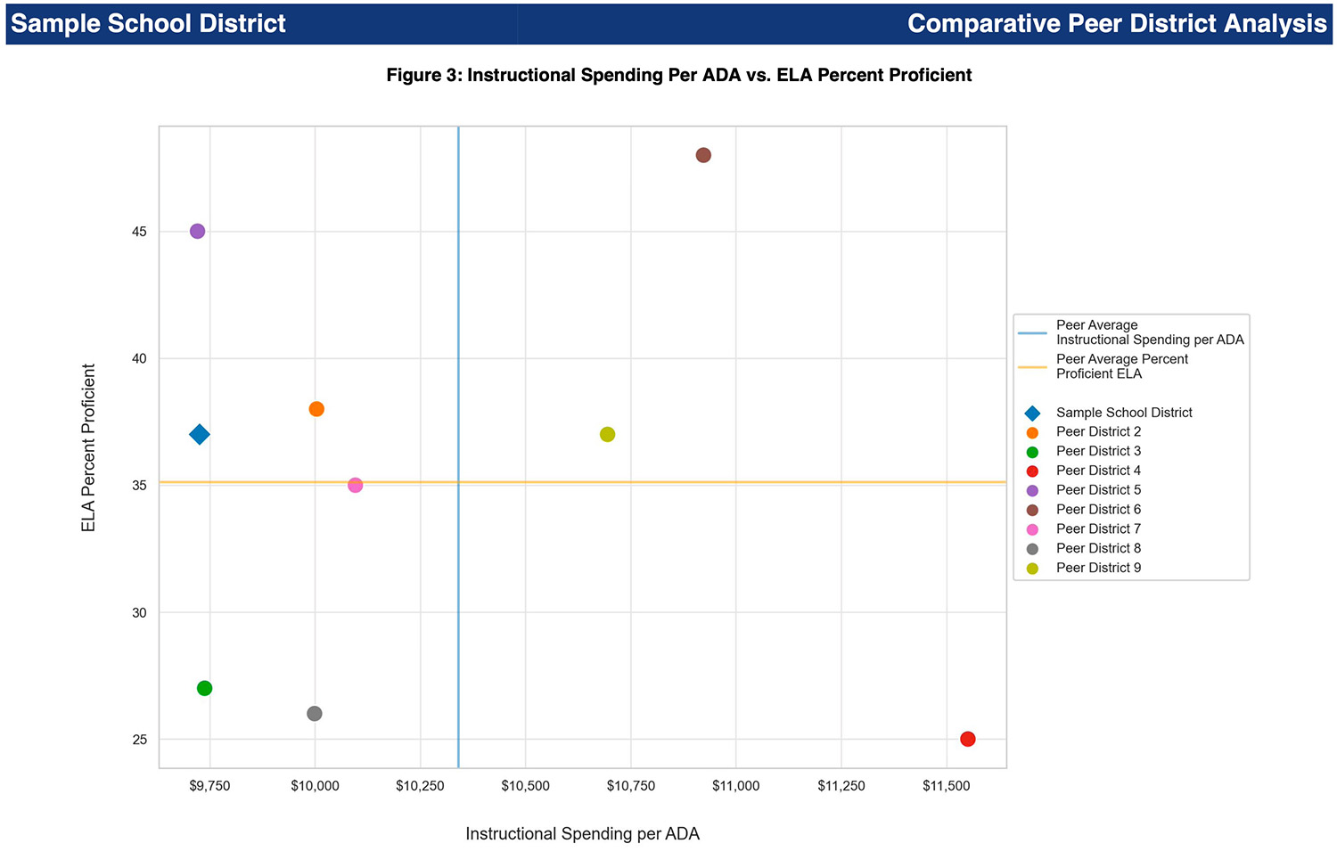
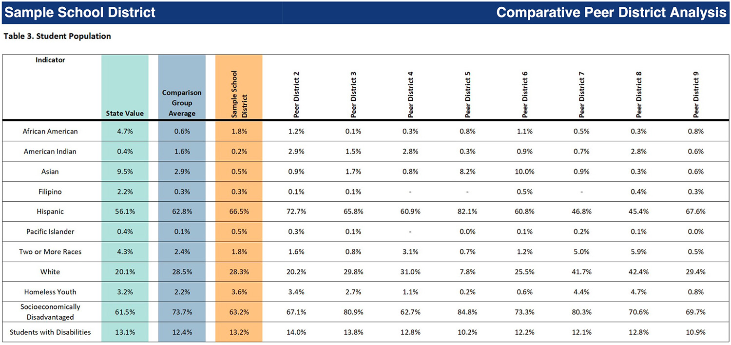
The report uses multiple formats to communicate insights, including bar charts, tables, and scatter plots. Here are some examples of what can be learned from a sample Comparative District Analysis in California:

Academic Proficiency
In both English Language Arts and Mathematics, the Sample School District’s proficiency rates are shown alongside its peers, the state average, and the average of the comparison group. This side-by-side view quickly reveals whether the district is outperforming or lagging behind.

Resource Investment and Outcomes
Perhaps the most compelling insights come from the scatter plots, which display instructional spending per Average Daily Attendance (ADA) against student proficiency. These visuals help answer a critical question for any school board or community member: Are we getting a return on our investment? If a district is in the upper right quadrant of the chart, it indicates above-average spending and above-average achievement, signaling a strong academic return on investment. Conversely, districts in the lower left quadrant may need to reflect on both their spending strategies and academic approaches.

Demographics and Context
The report also includes a snapshot of key student demographics and district characteristics, helping leaders contextualize results. For example, differences in English learner populations, special education percentages, or socio-economic indicators can provide a more complete picture when comparing achievement.
How can School Leaders Use This Data Brief?
District leaders can use this Comparative District Analysis in several strategic ways:
- Board Presentations
Visual data makes it easier for board members to grasp complex relationships between spending and outcomes. This board-ready data brief helps build trust and supports more informed decision-making. - Community Engagement
When presenting to community groups or parent organizations, this report serves as a transparent and accessible tool to explain district performance in context. It reframes the conversation from simple rankings to meaningful comparisons with similar districts. It’s ready to be published on your district’s website. - Strategic Planning
By identifying districts with similar demographics but higher outcomes, district leaders can begin to ask: What practices or strategies might we learn from these peer systems? This data-driven reflection supports continuous improvement.
Get Started Today
The Comparative District Analysis is more than just a data brief—it’s a conversation starter, a planning tool, and a framework for community trust. When paired with tools like ECRA’s Strategic Dashboard or School Improvement, district leaders are equipped not just with data, but with actionable insight to lead with clarity and confidence.
For questions or to learn how your district can access similar insights, reach out to the ECRA team.


